Tradona Markets
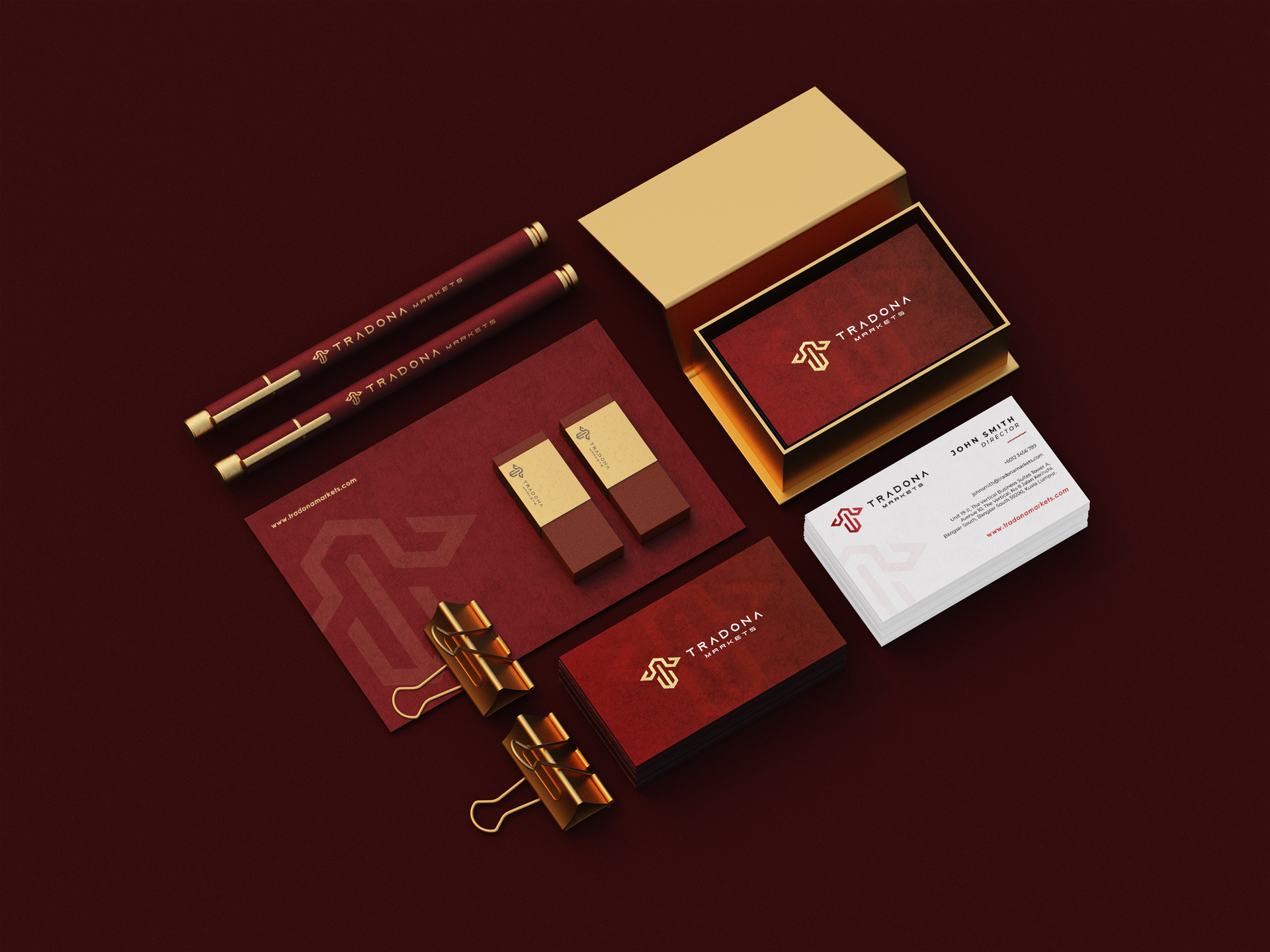
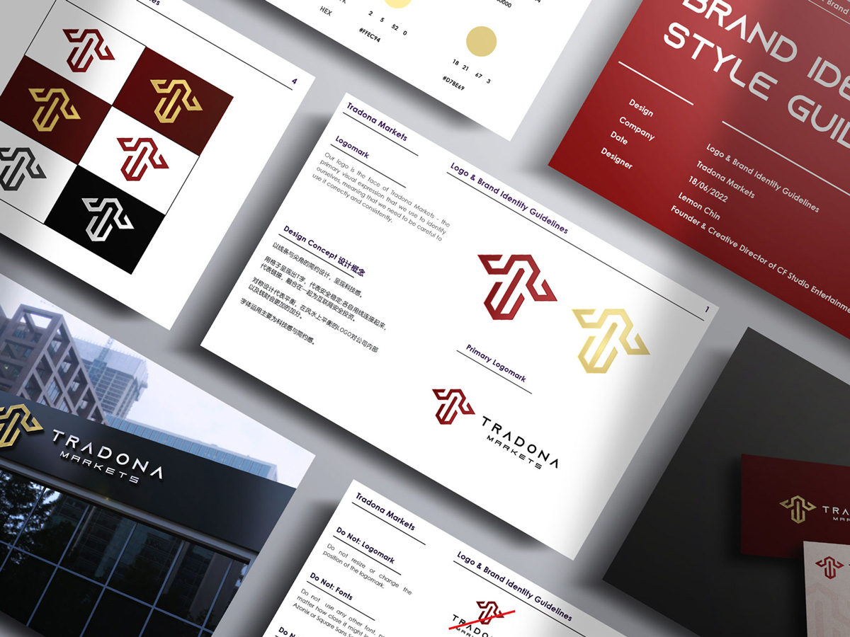
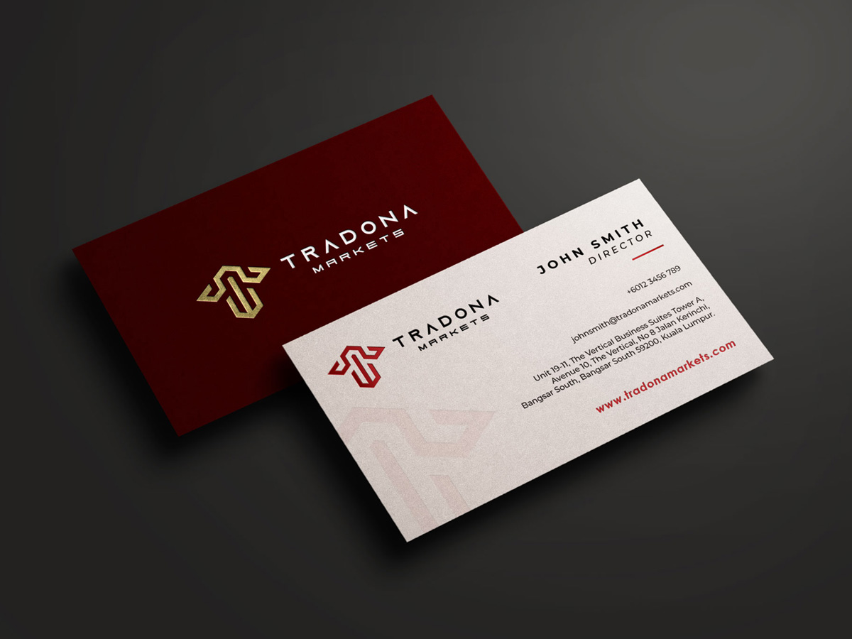
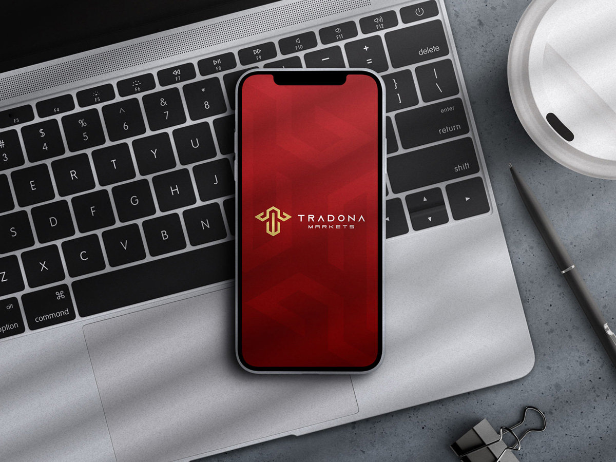
Design Concept
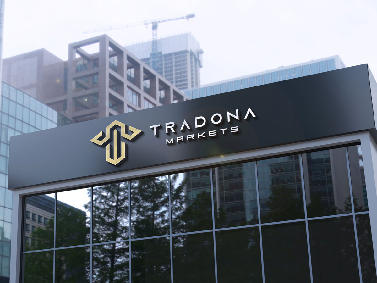
Minimalist design with lines and sharp corners to emphasise the sense of technology. Letter T is presented in a grid shape, which represents security and stability; designed with connected lines to represent connection, to highlight Tradona Markets as secure high-tech investment platform. Symmetrical design represents balance, in FengShui a balanced logo is helpful to company’s internal team and finance. The fonts type is minimalist and tech style.
Client
Tradona Markets
Designer
Lemon Chin
Services
Logo Branding
Date
June 18, 2022